The way website visitors are treated is more like dealing with indecisive creatures. They decide their stay based on the judgment they draw from arriving on the homepage in initial seconds.
From its cover it’s almost like judging a novel. Visitors draw inferences from the landing page and prefer to leave within seconds if they are unsatisfied, hence taking the average web page bounce rates somewhere between 40-50% (as reported by Google Analytics benchmarks).
Just imagine, a little off the beat and you can lose almost half of your visitors without a convert within seconds.
A study by Bounce Exchange stated that 70-96% of unsatisfied visitors would never come back to the website. To make sure that each of the visitors engage and convert over the website, you will need to understand the power of first 20 seconds.
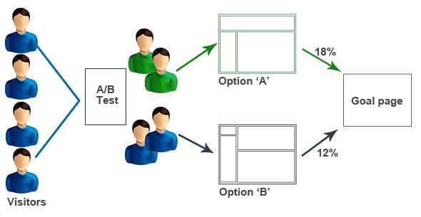
The parameters that you will have to focus upon are A/B testing, working upon the initial impressions and most importantly improving the experience for top entry pages. To optimize your visitor’s initial 20 seconds, we have compiled a two-series post.

The post focuses upon two key steps specified below.
- Improving the first impressions through use of visual elements
- Offer visitors with information on how to convert
Although you need to be in a rush to make adjustments to the entry web-page, you can pause for a moment and evaluate the bounce rate output of top 10 entry pages. This would help you deduce all the changes you need to make in order to be more engaged and converted.
Improving the first impressions through use of visual elements
The first thing that impresses any visitor is the visuals incorporated over the landing page. Nobody would like to read or scroll down if the initial images and visuals seem unattractive or irrelevant.
Make sure you focus well upon the visual elements that can influence the visitors well.
Let us start with the elements that you should test & optimize.
- Never restrict the images over your web-page to a particular category. You should test varied types of images for the landing pages. The images should however, not distract the users from the services or products that you are offering. For best results, you can test where different people look at first when reaching the website. Use of stock images is a strict no. Websites such as HighRise.com have reported an increase of 102% in conversions by simply working over the images.
- Using king size photos and sliders will not only fill the entire fold region of the page but also eliminate visitors’ focus from the main content. Images which are wide but not engaging can lead to a low rate of bounce.
- Photos and videos that move too fast can make it hard for visitors to concentrate on what you’re displaying. Avoid all sorts of distracting elements, as they reduce visitors’ chances of making conversions. Using more static images related to your brand proposal.
- Please ensure you get input from various sources on how to design the landing page. To get feedback from the testers, you can rely on websites such as 5secondtest.com or UsabilityHub.com.
- Make sure you are checking your website with broad pictures and without them. They could either be a diversion or help in triggering sales.
Offer visitors with information on how to convert
Once a visitor has stayed over the website for nearly 20 seconds, the next important thing would be offering them with value preposition service. It is important that you let the visitors know all the benefits that they can avail when they click further.
Keep the benefits and choices confined else things can get confusing. So the best way to convert visitors is to let them know about the next step. Here is how you can do this.
- The Call to Action buttons that you are displaying over the website should be sufficient for letting the visitors make the decision. Use only the major ones that could help the users in decision making. Sites such as WriteWork.com have experienced an increase of 50% by simple placing the prominent CTA buttons.
- The navigation menu in header should be depicting only the useful options and should not look overcrowded. You should take the lesser important links such as ‘contact’ and ‘blog’ either into the footer or in a separate navigation near the top right. Adding in key navigation items like ‘why choose us’ and testimonials will help show value proposition and social proof too.
- Keep the page length average, eventually avoiding overly long pages. Long pages make it difficult for the user to scroll down and bring the thought of leaving the website to mind. When visitors begin scrolling down and witness too much content, they might give up without actually knowing what you are offering.
- Make sure you limit the sections and promotions displayed over the homepage as they tend to clutter things and draw attention away from the prominent content or call to actions. Websites such as Gyminee.com witnesses an increase in homepage conversions by 20% while doing nothing but just organizing the homepage.
Are you guys utilizing any of these techniques for increasing user engagement and conversion? If not, contact us for some amazing marketing tips. Click here and explore Part 2.

